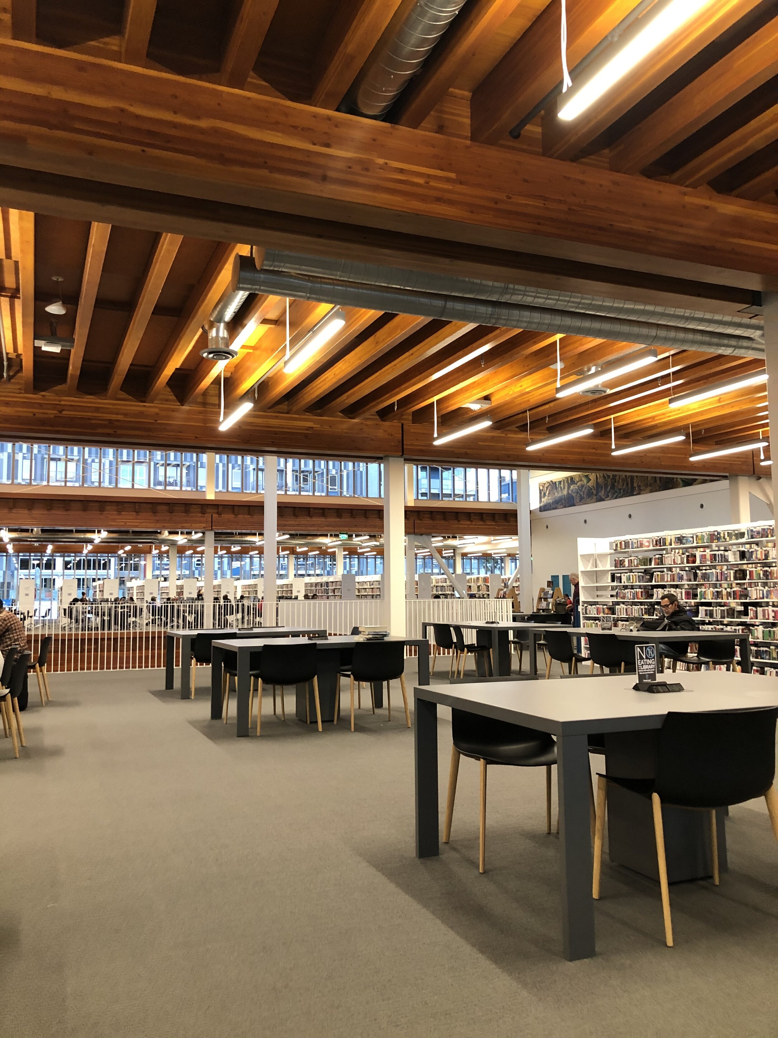
If you’re a book-lover living in Long Beach and haven’t yet visited the new Billie Jean King Main Library, well, then I’m jealous of you — because you still get to experience this stunner for the first time.
Part of downtown’s new civic center, the 93,000-square-foot library houses some 300,000 books and replaces the old, subterranean branch that I personally found very stuffy and claustrophobic.
Honestly, there are so many fun finds in the new library, it was hard to choose only ten “best spots” for our list. But Brown Paper Press intern Wyleen Oaes and I managed it somehow. We’re survivors like that.
But first, a little aside:
When my mom was getting her PhD (in library science) in the ‘90s, she wrote her dissertation on library architecture. She was particularly drawn to how the use of space can either draw readers in or turn them off. As a former children’s librarian, her philosophy was that a library ought to be a second home for its residents, as inviting as a living room and reflective of the values of the community-at-large.
That’s my mom, Nancy Thomas, checking out a photograph in the Miller Room.
Unfortunately, she told me, libraries often get it wrong. Once, for instance, she was touring libraries in an African-American enclave of Paterson, New Jersey — a multi-ethnic community that has rather famously struggled with poverty and other hardships. In one library, she came across a poster of Martin Luther King, Jr., which, she pointed out, could have been a wonderful focal point — something to inspire visitors and give them a sense of belonging. Instead, the poster was stuck to a side wall, frayed and torn at the edges, and crooked, as though someone had literally slapped it up there and walked away. Because of that, the potential to appear inviting, or to reflect the values of the people of Paterson, was lost or wasted, or both.
This is all to say I was especially curious about what she would say about Long Beach new main-branch library — so I took her with me during my first visit. Suffice it to say, we were both won over. My mom marveled at all the details, while I salivated over all that wood and glass.
And now, in no particular order, our 10 favorite spots in the new library.
1. ‘Between the Divide’ Exhibition
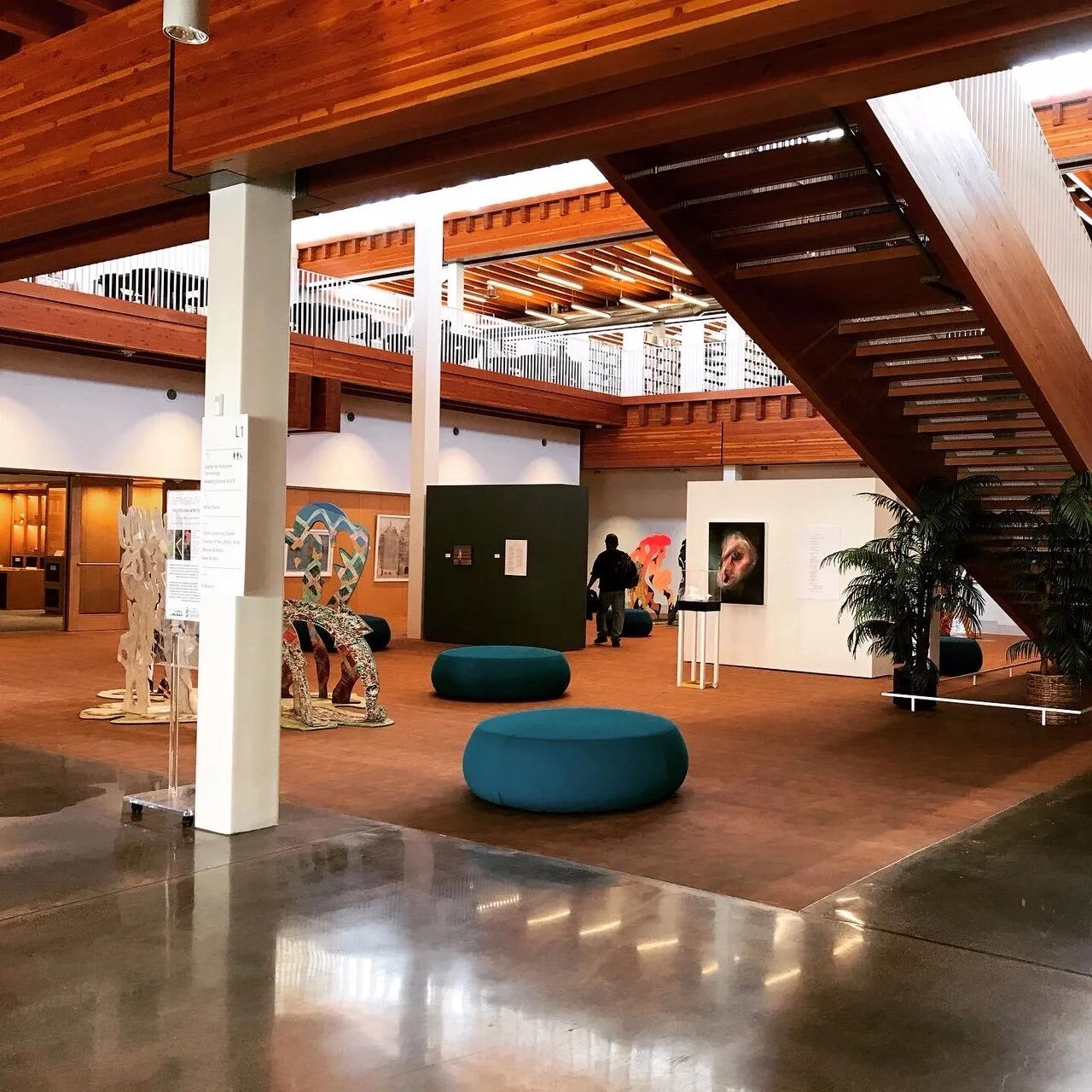
Wyleen: All the artwork in this part of the library livened up the main entrance. It’s a great way to not only represent local artists, but also current social justice issues at the community level. This exhibit made me think how the library has transformed from a resource center to a community center.
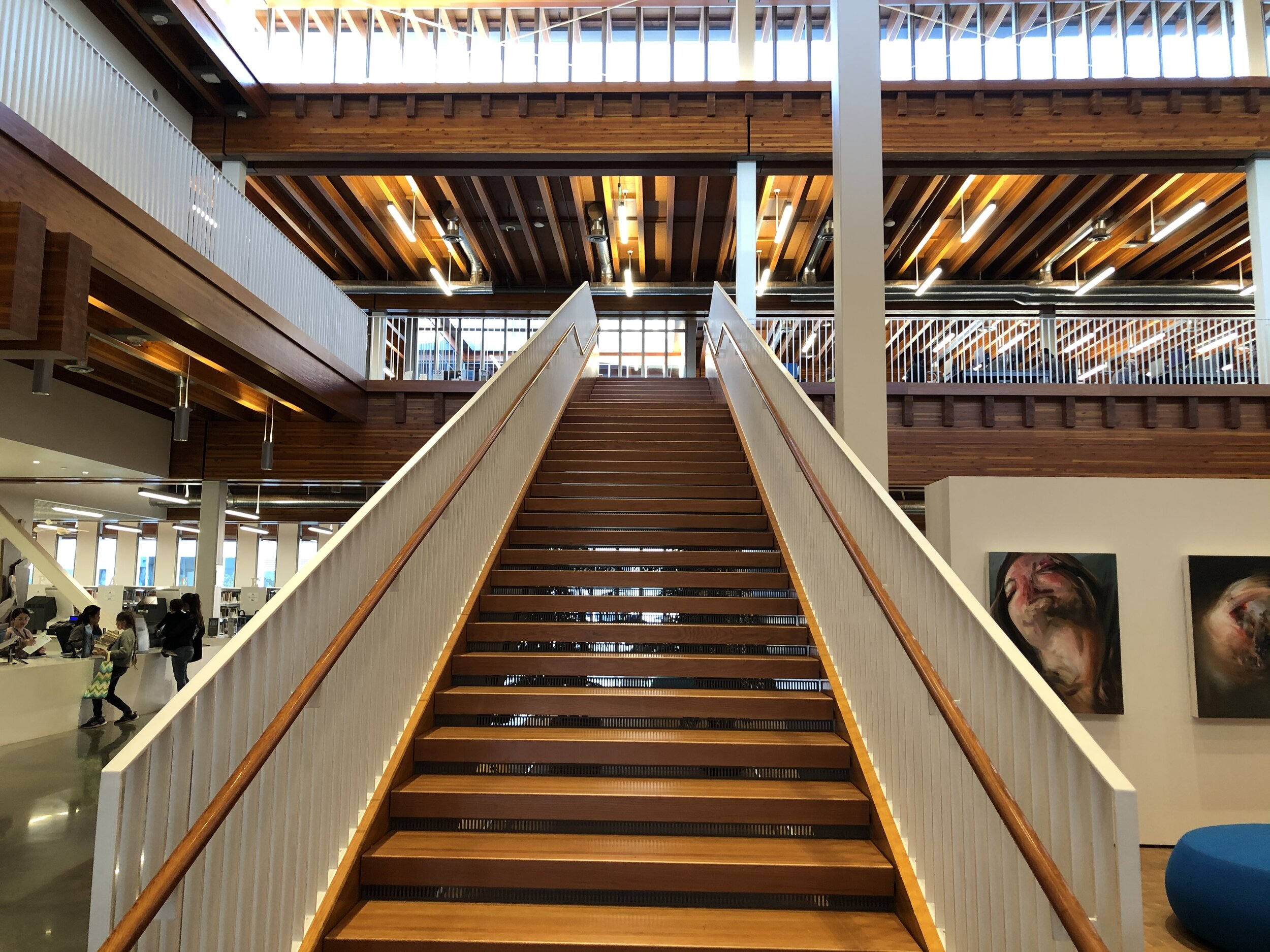
Wendy: The whole entrance was a treat. So open and bright. You could see so much of the library from just one spot. The art, particularly the wall art featuring “Conservative America” versus “Liberal America” was as hilarious as it was poignant. And those stairs! Drool-worthy.
2. The Miller Room
Wyleen: I was immediately drawn to the Asian artwork and the displays that featured Billie Jean King. It was also cool to see first-edition books that were published a century ago. I didn’t even think that a local library like ours could have such a collection!
Wendy: I agree! Tons of great art books here, plus a hand-written Bible and some artifacts left over from Long Beach’s late, great Acres of Books bookstore.
3. The Studio
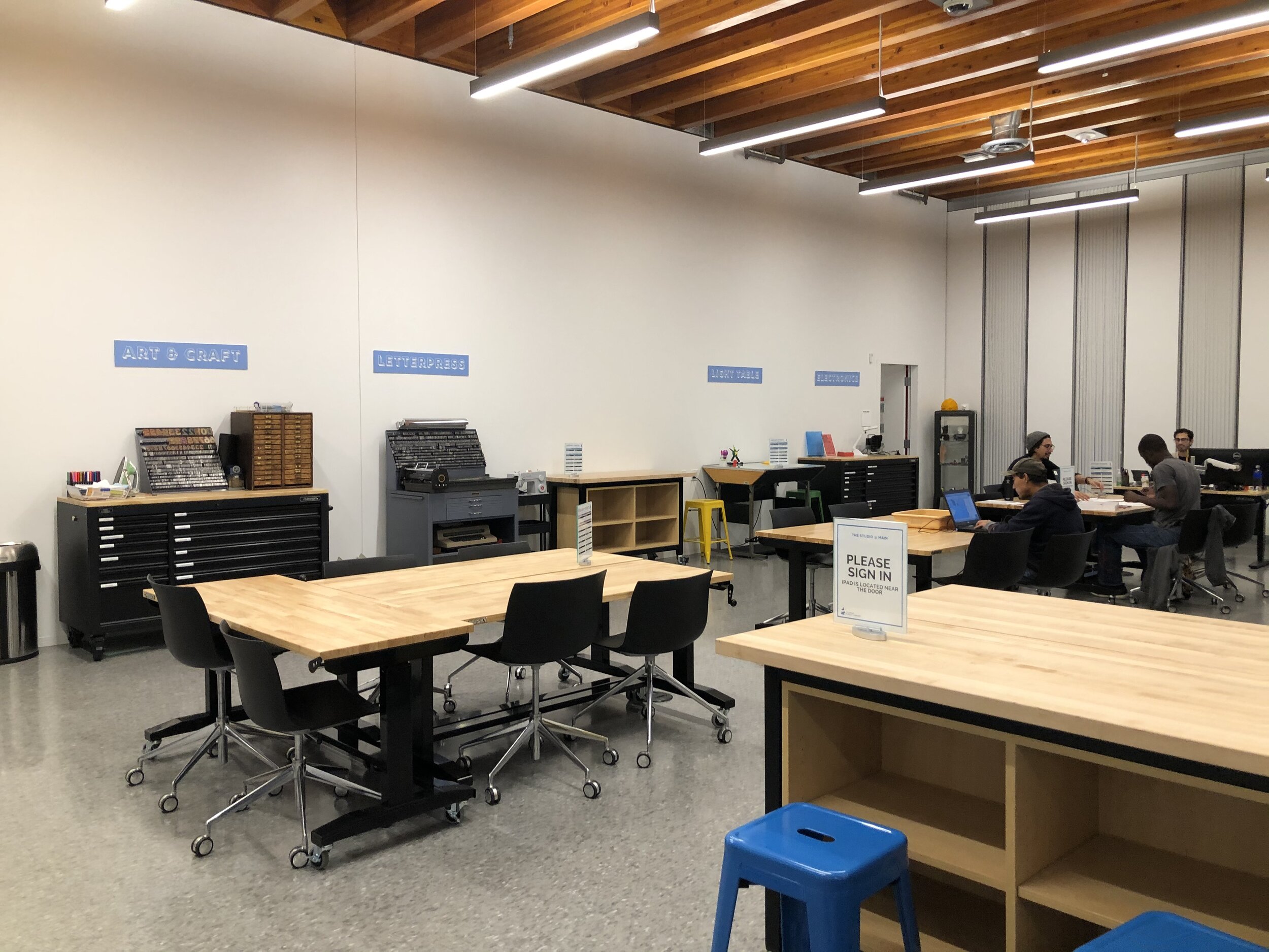
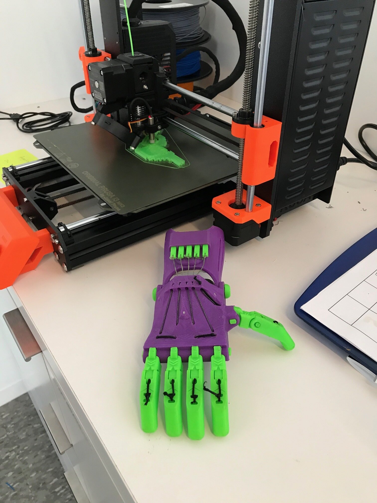
Wyleen: There were so many creative tools, both physical and digital, readily available for patrons to use. The best part is that they can all be used for free! From 3D printers and laser cutters to letter presses and power tools, The Studio really had everything any creative junkie would love.
Wendy: My mom and I were entranced with this place. So much to do. My friend Ryan works at the library and showed us the adjacent room, as well, which features a sound studio to record albums, a green screen for making movies and a virtual reality system. And those 3D printers really were the coolest. (Can you believe a printer made that entire robotic hand?)
4. Kids Space
Wyleen: I love children’s books. The crane sculpture and the round, cushioned seats were inviting and playful. It was also cute how the bookshelves were alphabetized with lighted letters.
Wendy: This was one of my mom’s favorites. The children’s theater area was airy and light, but still tucked way far enough from the adult section that children need not be forced to whisper the entire time. In fact, there’s a separate, enclosed room with tables and sinks for special projects and parties. A great example of what a children’s library can be.
5 &6. The Magazine and Zine Sections
Wendy: The magazine section was far more reminiscent of a bookstore than a library — which I loved. All the magazines were face-out, under the mural that they had brought over from the old library. A great touch. I missed the Zine section, but Wyleen found it.
Wyleen: I got to learn what zines were! There were all kinds of publications here; some were made by kids and others by adults. I had no idea this was a thing until I saw these zines. Overall, it was very interesting and unique.
6. Teenspace
Wyleen: This corner of the second floor was the most colorful part of the library. I liked how the spot was labeled using a projected logo on the wall. The furniture looked fun too. The spot also had a wonderful view of Broadway.
Wendy: Teenagers are so often disrespected in public places. Made to feel like untrustworthy annoyances. Here, teens get the library’s full respect — and a downright huge area to call their own.
7. The Study Area
Wyleen: As a college student, I’m always looking for places to study, and this spot was ideal. The area they set aside for quiet studying and productivity was awesome. There was an ample number of desks, couch seating and outlets.”
8. The Book Aisles
Wyleen: The selection for non-fiction books on the second floor was insane. There were so many! The other book aisles in the library were no different. It was also nice that there were computers for looking up books at the end of some aisles. The overall layout of the books was clean, clearly labeled, and easy-to-navigate.
Wendy: This what I call book porn. Every aisle seemed to beckon me to put down roots and stay awhile.
10. ThE Window Seats
Wendy: Ah, yes. Nothing quite like a window seat to clear your head. And in a building consisting primarily of floor-to ceiling windows, there was no shortage.
Wyleen: A good place for some quiet reading and relaxing.
Okay, fellow library fans, what did we miss?
